

Lead Product Designer · Advisor & Member Experience
Rockefeller Capital Management
Practical ways to improve the digital products used by high net worth individuals and the advisors who look after them.
01
Introduction
When I joined Rockefeller Capital Management as lead UX designer for mobile, I started by studying the firm itself: its digital products, its brand values and the people it serves. That groundwork shaped every decision that followed.
Context
We were designing for two groups: advisors and members. This case study focuses on the advisors.
02
Wealth management is different from the rest of finance
- 1
Designing for trust
Trust here means accuracy, precision and professionalism. A rounding error on a portfolio value isn't a minor bug. It can put a relationship at risk.
- 2
Regulatory constraints
Legal review on copy, disclosure requirements, audit trails and data privacy all shape what can ship.
- 3
The actual users
The primary users are financial advisors, relationship managers and portfolio managers, and sometimes operations or compliance teams.
- 4
Data-dense interfaces
Dense information has to be scannable, prioritized and actionable, without stripping out the context expert users rely on.
- 5
Advisor workflow
An advisor's day means preparing for client meetings, running them (often over a screen share or a printed report), following up on action items, watching portfolios for drift and alerts, and prospecting for new clients.
The advisor side of the problem
Advisors were frustrated by data scattered across too many programs.
The advisor platform
One dashboard instead of many programs
AUM, clients, performance against benchmark and allocation, together on one screen. Try the time periods and the portfolio menu.
Portfolio Dashboard
Welcome back, John. Here's your portfolio overview.
Total AUM
$2.4B
+5.2% this month
Active Clients
847
+12 this month
Portfolio Performance
+8.7%
YTD return
New Investments
$45.2M
This quarter
Portfolio Performance
Portfolio value over time vs benchmark
Total Return
+22.3%
+$27,000
vs Benchmark
+5.7%
Outperforming
Volatility
12.4%
Within target
Asset Allocation
$170M
Total AUM
03
My role
- End-to-end product design
- Leading a small team of designers
- Internal and external stakeholder management
- Data analysis
- Prototyping, collaboration and ideation
- Creating a new design system
Constraints
Research pushback
RCM's team didn't see a clear link between research and validating ideas, so I expected pushback on research and planned for it.
Confidentiality
Client confidentiality came first. Beyond knowing they were high net worth individuals, we weren't given client details.
04
Key features and solutions
Driving engagement
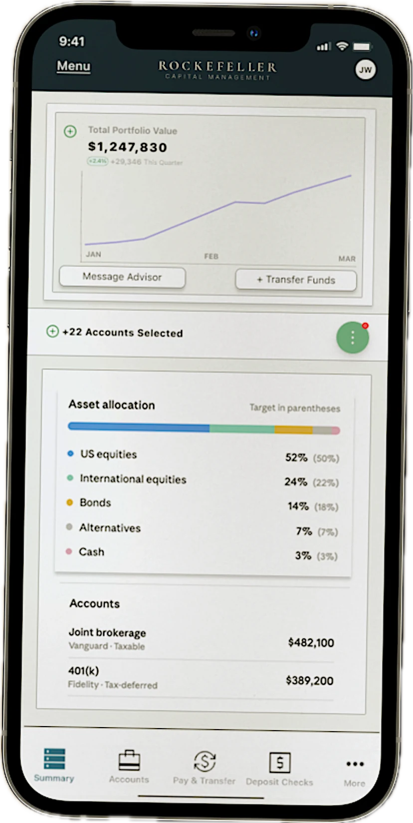
Product metrics showed very low engagement and daily active users. We designed a curated feed of finance articles matched to each client's interests, with a filter just below the nav bar, to give people a reason to come back.
Downloadable reports
In usability testing, participants called the previous app "boring" and didn't want to read all their account information on a small screen. We added the option to download full reports.
“No one wants to look at the equivalent of an Excel spreadsheet on their phone.”
Usability test participant
Proactive notifications
One of the most common complaints in RCM's research reports was not being told about changes to portfolios and accounts. We designed a neutral-toned modal that keeps people informed without alarming them.
Customizable visualization
Users choose the colors and chart types for their data, and which accounts to include or leave out, with drag-and-drop controls. This took the longest: four rounds of usability testing before participants reached the "aha" moment we were designing for.
External integrations
Working with RCM's engineering team and a set of integrations and APIs, we designed a frictionless way to add accounts held outside RCM, so users could see their whole portfolio in one place.
05
Rebrand of the RCM website
Why does consistency build trust?
Trust between people and their financial institutions is at an all-time low.
83%
of respondents named a high-quality user experience as the most critical factor in choosing a financial services provider. Forrester and BAI
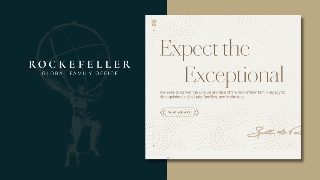
Mapping the user journey, I saw right away that the mobile app lacked consistency in its interactions and visuals, and had no design system.
That's where we began. The short timeline didn't leave room for an expansive system, so I made sure the foundations were in place, aligned closely with RCM's visual identity, and easy to scale.
06
In summary
Constraints and stakeholder management
The client was under a lot of pressure in a highly political office. From the first few meetings I knew I had to show that my team and I could be trusted to deliver.
Drawing on my earlier experience working directly for high net worth individuals, I made a point of bringing solutions whenever we hit problems, and kept communication open and transparent with the RCM staff leading the initiative.
Outcomes and process
Before meeting the client I researched RCM down to the roles on its staff, so when we needed qualitative research I knew they had their own researchers. I wrote and handed off interview questions for them to run with clients, then checked their insight reports for unconscious bias. Together with our own usability testing, this led us to the solutions we shipped.
Both Rockefeller Capital Management and its clients received the new app well. RCM reported higher adoption and growth in monthly and daily active users soon after the relaunch.
← Back to case studies